Studio photo processing
I would like to show you one of the options for processing studio photography in Lightroom. The processing is very simple - contrast, shadows, orange to minus. But it looks, in my opinion, quite interesting!
The photo is still awaiting final retouching in Photoshop, so don’t pay attention to the dirty wall and other little things. Download the preset and use it for your pleasure!
Pencil drawing
I have long wanted to make a preset for Lightroom that would allow me to simulate drawing with a pencil. There is a huge amount of material on the Internet on how to perform processing in the style of a pencil drawing in Photoshop. But I didn’t find a single article about how to process a photo in Lightroom in the style of a pencil drawing!
Photo processing in the open air
In order to get a beautiful photograph of a model in the open air, you need to choose the right light. In this case, the shooting was carried out in a forest and the model was not located in direct sun, but in the shade of trees and illuminated by diffused light. Which, overall, gave a good result.
Film beauty
Working with color, curves, increasing contrast and adding a grainy effect - this made it possible to achieve such photo processing. This Lightroom preset will help you process your photos in the same way!
Brown retro
There are photographs to which you can apply many different treatments. This is exactly the case, and therefore it was decided to do the now popular brown tinting. As you can see, it turned out very well! Using a curve and a slider Shadows lightened the shadows and also muted the color using Saturation. You can see all other settings yourself in the preset.
Portrait of a Veteran
To create such a dramatic portrait of a veteran, the contrast had to be increased as much as possible. This was done by working with curves - the steepest part of the curve is located in the highlight zone.
Tilt Shift effect
Let's return to photographs with small models of real objects. This is due to optical illusion. This depth of field will never be achieved when shooting from a distance with a regular wide-angle lens! That's why it seems to us that the shooting was done at close range, and all the objects are miniatures!
"Golden Skin"
This preset is the first step for processing a portrait photo. The resulting image still needs a lot of work in Photoshop. But basic things - skinton, contrast And color correction It’s much more convenient and faster to do in Lightroom.
Film imitation
To simulate photographs taken with a film camera, you need to carry out individual processing for each photograph. There is no universal recipe!
Red light effect
I often see black and white photographs with this flare effect. In Lightroom version 5, this is done very simply - using the Radial Filter tool. You can choose absolutely any color. In this example, the contrast of the selected area is further increased to enhance the effect. You can increase, decrease and move this highlight at your discretion.
Dramatic sky
To create this effect, when taking a photograph, expose to the sky so that it does not fall out. It doesn't matter if the rest of the photo is darker than you'd like - it'll be fairly easy to brighten it up in post-processing. Apply this preset to the resulting frame and you'll see a dramatic landscape like this.
Juicy tinting option
I present to your attention another preset for toning pictures. After applying the preset, the photo becomes more contrasty and warmer. These colors are achieved by applying curves. To get the final result, I reduced the exposure by half a tone, and you can adjust it to your liking.
Retro imitation polaroid
Make your photos look like those from an old Polaroid! A very interesting effect, which is realized by channel-by-channel work with curves (Curves) and color. In this preset, the black point is greatly raised, which is why the photo looks covered in a slight haze.
Add black stripes to the top and bottom of the frame
With this preset you can quickly add black stripes to the top and bottom of the frame. Many people use this effect. It gives the picture a “cinematic quality” and a special charm. This effect is also called: porridge (accent on the last syllable) or curtains.
Preset for Lightroom: Wedding photography processing
A preset that will make your wedding photography warmer and more cheerful. The bias goes towards yellow shades in the highlights and purple shades in the shadows (just a little). A small dark vignette is superimposed, which is practically unnoticeable, but still adds a peculiar atmosphere to the frame. I raised the exposure by half a stop, when you use this wedding preset, adjust it your way.
water world
To take pictures of the inhabitants of the deep sea, it is not necessary to go underwater with scuba gear. Below is a shot of a typical small home aquarium. Since the camera did not set the correct white balance in the preset, it was corrected and the extraneous yellow tint was removed. It seems to me that with this processing the photo turned out to be quite atmospheric.
Processing snowflakes
A very simple preset that removes third-party shades and makes a photo with snow attractive, rich and contrasting. Enjoy it for your health.
Tinting the winter landscape
I suggest downloading a preset for Lightroom that will transform your winter landscape and give it more color and expressiveness. The preset implements toning in beautiful blue-green shades and increasing contrast. I recommend it to all fans of winter landscape photography.
Low contrast portrait
A very popular effect at the moment! It somewhat resembles an old photo and evokes romantic associations. In the preset, the original colors of the photo are practically not affected, only the contrast is lowered and the highlights/shadows are adjusted.
Soft colors
After applying this preset, your photo will have soft colors and low contrast. For portraits and studio portraits, this effect is perfect. You can also process wedding photos with this preset.
Processing in Lightroom in retro style
This retro preset for Lightroom will make your photo look like an old one. The yellowish faded colors create an interesting atmosphere in the photo. I think this retro style effect will appeal to many people.
Converting a concert photograph to black and white
Sometimes, when shooting in a club or at a concert, due to the lighting and bright spotlights, light occurs and the photo turns out, at first glance, to be spoiled. The best option would be to convert such a photo to black and white. This preset will help you in this matter in order to make a black and white photo from a concert (and not only) photograph.
Preset for processing photos from a rock concert
This preset is used to process photos from rock concerts. It seems to me that these colors are just right for such an event. Download and use!
Vanilla photo processing
And today we will paint the cat in purple vanilla shades :) I think the cat will not be offended, but rather will be pleasantly surprised at how much more beautiful the photo has become after using this preset. I recommend to all lovers of cats and vanilla flowers to download this preset immediately!
Lightroom preset for processing images with flowers
To ensure that processing flowers in Lightroom does not take much time, so that your photographs of flowers turn out bright and beautiful, you can use this preset. The saturation is increased very carefully so that the colors are within the color space. The tone leans more towards warm shades.
Nowadays, quite a lot of designers and ordinary users choose the Lightroom program (Adobe Lightroom) to work with photographs. Firstly, it allows you to retouch and process photographs, and secondly, it can be used to quickly organize a catalog of images. At the same time, you can also find special and additional tools for it on the Internet, in particular, presets. These are a kind of blank parameters (contrast, color) and effects for color correction and image enhancement. Today’s post is dedicated to the topic of processing winter photos in Lightroom, or to be more precise, we’ll look at special ones.
This tool allows you to quickly change the look of your photo with one click. Essentially, it's very similar to . With winter Lightroom presets, you can create beautiful atmospheric photos by changing the lighting, adding snow, etc.

The main advantages of using it are automation of image processing, improved speed and efficiency. Yes, you could easily process winter photos manually in Lightroom or Photoshop, but how long would it take to implement 10-20 options? That’s why the function of winter presets, whether it’s winter or any other theme, is extremely convenient.
You can change the emphasis on image objects, create background blur, etc. When processing winter photos in Lightroom, a feature with predominant cold tones is often used. This adds a certain “frosty winter” effect to the picture.

And if you also apply here changing the brightness of the picture... For some types of photographs this may be a good solution.

I think the difference is visible to the naked eye. For each of your pictures, you can choose the appropriate solution to make it better. Moreover, implementation takes seconds. Here's what processing a winter photo in Lightroom looks like on video (using a set of winter Lightroom presets).
There is nothing complicated. After implementing one of the effects, you can change the settings of the photo in order to modify it in accordance with your requirements.
Now you can order a set with a 50% discount- for only 790 rubles. 20 different payment options are available: bank transfers, electronic payment systems, etc. After payment, you will receive a link by email where you can download winter presets for Lightroom. Collection volume - 33 MB.
As a bonus to regular materials you will receive:
- set of black and white effects;
- snow preset for Lightroom;
- video tutorials on application (for beginners).
The latter allows you to create a “winter mood” for almost any photo.

In general, in my opinion, this set is an excellent solution if you have to process winter photo in Lightroom. More than 170 different effects + the ability to add snow. We combine all this with the basic capabilities of Lightroom and we get a great tool.
Using presets when processing photos is the best thing you can do if you want to get gorgeous photos, which you are not ashamed to show to your friends and post on the Internet.
Maxim Basmanov launched new collection winter presets that are more relevant than ever. What is a preset? These are color and tone correction values that are preset. The preset launches with just one button and applies the specified values in Lightroom in seconds.
The program will do all the photo processing for you, which means a huge amount of time saved for you. With this set of presets you can process up to hundreds of photos per minute.
Advantages of the "Winter Presets" course:
Each preset was personally recorded by Maxim Basmanov and equipped with custom settings. To make it easier to understand, each preset comes with a video tutorial on how to work with it.
Bonuses from Maxim Basmanov:
- A set of ready-made snow. Unique snow sets will help you create a winter atmosphere in any photo in a matter of seconds.
- Set of presets "Black and White". Classics will never go out of fashion, so the author decided to add this preset to the set, which will allow you to make a unique photo from each photo, worthy of a frame on the wall.
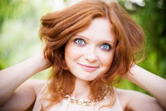
Today we will talk about tinting winter photos. I hope that many people have already accumulated quite a lot of winter photos after the New Year and just winter photo shoots. And in this video we will work with you in Lightroom and create a preset that can be used in your photographs in the future.
In our case, we want to make the photo unusual and make it a little cold. That is, add a touch of winter to it. We just need to do something unusual, make it not standard. That is, let's add a little coldness to our photo and some brown shades, which are popular now. I don't know if this will be popular in a few months when you watch this video, but now it is popular and so we will follow the trends.
Let's return to the lesson. Now let's remove the left and top panel so that they don't interfere with us. Now all our attention is on the photo.
The first step we will configure is the basic settings. They are quite simple.

Add some cool shades. To do this we need to add a little blue. In fact, we won't be adding much of this blue color, because later we will be adjusting all this in "Camera Calibration". Setting up:
- “Temperature” (Temp) is reduced to the left side somewhere to -2;
- Increase the “Tint” setting slightly to +16;
- “Exposure” we will also add a little +0.3;
- “Highlights” we will reduce to -30;
- “Shadows” is raised to +30;
- “White” we will have approximately +70;
- “Black” will also be raised, to about +30;
- “Clarity” we will raise to +18;
- “Vibration” will be raised to +27.
You can see how it was before and after the setting using a special switch to the left of the setting name.


Now let's go down to "Camera Calibration" and adjust a few things. We will have a “process” in 2012. We have one profile here, we’ll leave it as it is. Set the settings:
In Shadows, let the Tint setting be -2;
- In the red channel Hue +48, Saturation -20;
- In the green channel Hue +58, Saturation +66;
- In the blue channel Hue -84, Saturation -93.

Our photo is already getting better, but we will need to adjust other parameters, which we will now add. Let's move on to our tone curve "Tone Curve". Let's select RGB and raise the white point a little higher. Let's also slightly adjust other points.

Let's go to the "Red" channel. We also change the curve a little.

We look at “Green”, we also make a small correction here.

Let's go to RGB, go to the settings in manual mode.

"Shadows" will be reduced to -54.

We have slightly restored our color on the face, which is already good. Now we are moving to HSL and will adjust our colors individually. Go to the "Hue" section. We don't touch Red and Orange. Setting up:
Yellow, reduce it to a value of -28;
- Green slightly reduced to -40. There are green Christmas trees in the photo and, of course, you choose the value for your photo;
- Let's add a little blue "Aqua" +89.

Let's move on to "Saturation". In the same way, we do not touch red and orange. Setting up:
Set Yellow to the value -36;
- Green to -51.

Let's move on to "Luminance". Since our face has become too gray, we still need to return the color to it. Setting up:
Red set +28;
- Orange +19;
- Yellow +36.

If you look at the current result, we added a little red tint, which is popular, and at the same time we have blue tints in the photo. Let's go to "SplitToning", we now need to mix some colors. The setting that works for this photo is:
Highlights. Hue - 199 and Saturation - 16;
- Shadows" Hue - 255 and Saturation - 6;
- Reduce Balance to -16.

In this case Blue colour We have the predominant color and our girl is just the color we need. All that remains are very simple effects. We'll add a little detail to make our girl more defined and to make her stand out visually. We work with the "Detail" setting. They are individual for each photo. There are a lot of details in this photograph, for example, the snow is very clearly visible. In this example settings:
Amount - 51;
- Radius - 1.5;
- Detail - 36;
- Color quite a bit - 25.

Now let's add effects using the "Brush". Let's take it and set the parameters:
Temp -3;
- Tint +19;
- Highlights +18;
- Shadows -2;
- Sharpness -52.

We turn on the mask so that we can see in which areas we are using the brush and paint over the area where we have trees.

When you exit the mask, you can see that the background becomes blurred and a little red is added, probably even more brown. By this we achieve that there is still more attention to the girl.