Everyone knows that black visually makes the figure slimmer, and white makes it fatter. But your color scheme in clothes is not limited to these colors. Other colors also have visual deception properties. Let's analyze by what laws and principles we see something that is not actually there, in order to make this effect work for ourselves.
1 Light appears larger than dark.
The apogee of this statement, just the same, is black and white. This visual trick is related to the ability of a colored object to reflect or absorb light rays.
Things white color reflect the maximum number of light waves that diverge in different directions. As a result, the boundary between white and another color is blurred, making objects appear larger than they actually are.
Black color absorbs light rays, so its borders appear clearer than a white object, and, therefore, it will look smaller than it really is.
Gray color reflects light rays half as much as white, and the same number of times more than black. Its borders are not as pronounced as in black, not as blurred as in white, but at the same time it loses contrast with the environment. Therefore, this color will slim during the day (not like black, but still) and full in the late evening or at night.
Each color has dark, light and medium shades. They, too, obey the laws of greater or lesser reflection. Light shades of any color will increase dimensions in relation to dark shades.
The expanding and contracting effect is useful for masking figure flaws.
Women who seem to be fuller than they would like, it is better to use dark or medium colors.
For thin people, light and medium are more suitable.
In addition, you can mask slightly plump parts of the figure and unnecessarily thin ones by combining dark and light, while remaining in the same range.
2 Shiny fabrics, even dark ones, are full
It is logical to assume that the mirror surface reflects light much more than a white canvas. A halo of light draws a couple of centimeters for you.
Therefore, if you want to look slimmer, then do not choose a black sparkly dress. Black, in this case, does not compensate for its brilliance. If you fundamentally like glitter, use it in accessories.
But for thin, shiny fabrics are a great help for correction.
And if you have a figure resembling a pear, then a shiny top will suit you.
3 Cold shades slim more than warm ones
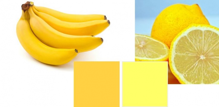
Yellow, red, orange. They selectively reflect waves in their short range. You can’t say about them as about white - it reflects light waves of all sizes ( see the physics of color) But these colors are also able to expand objects.
Blue green, blue, purple. Besides the fact that these colors are darker at their highest brightness than the brightest warm colors, even when diluted with white, they give less expansion effect than warm colors. This means that a light blue color will be less full than a light warm pink.
So, if you have a choice between warm dark and cold dark, with the main requirement of hiding excess weight, then choose a cold shade.
4 The brighter the color, the more it fills.
Intense shades blind the eye, and this effect causes blurring of the boundaries. Even bright blue: cold and not light, will make you wider than gray-blue of the same lightness.
Let's summarize
According to the given data, it turns out that for overweight people, dark, not bright, cold colors will be ideal. It's like in food: everything that is not tasty is healthy. But I don't think we should go to such extremes.
It is worth knowing that vertical stripes, whatever the color, are slimming, even if it is a peeking blouse from under a cardigan.
And dark things should always be diluted with bright accessories.
I suggest the following combinations for your consideration:
Color combination for overweight people
Cherno Blue colour
Alternative to black: deep black-blue color. This color is already different from achromatic: it is more fresh, rich, piquant. Suitable for both office and banquet. Combine it with light juicy colors.
Such as purple, burgundy, gold, green, calm azure, brown, lilac, medium beige.
Malachite color
Rich, luxurious, exotic color - the perfect solution for a full figure. Your forms in it will become appetizing and attractive. Malachite universal: everyday and festive color, combined with the color of pink orchid, raspberry, sand, pale green, aqua, coffee with milk, light lilac, and light beige.
Cherry color
Feminine and erotic. Soft and exciting. He will not leave anyone indifferent. Conquer hearts, showing all your feminine nature. Your round shapes in this color will become a virtue.
Cherry color is combined with lilac, raspberry, camel, green blue, gray blue, royal blue, lilac, light brown.
Let's not forget about slender girls who could add a couple of kilograms. Fortunately, they have a choice.
First: these are light warm shades, combine them with bright accessories, add shine.
Second: use shiny fabrics: patent leather, materials with sequins, satin, fabrics with lurix.
Third: bright light clothes.
Color combination for thin people
Silver peony or beige pink.
This color is proposed by Panton as one of the fashion leaders for the spring-summer 2011 season. Delicate, mysterious, filled with the inner strength of a blooming flower. It is more intended for leisure than for the office, although it will not be against everyday wear.
Beige pink is combined with warm pink, orange red, orange sorbet, fresh green, aquamarine, denim blue, coffee with milk, bright lilac, light gray colors.
Light gray green
Restrained, sophisticated. Looks good on satin fabrics. It is designed for the office, as well as for a holiday or recreation. Combine it with glitter, you will look like a rare tropical fish that accidentally got into a gray city.
Grey-green combines with megento pink, red, yellow-orange, olive, blue-green, old gold, pink purple, pale gold.
fuchsia color
Bright, fast, bold. He is always distinguished from the crowd. Fuchsia does not irritate the eyes, and is perfect for working days, but at the holiday it will be a special pearl.
Combine fuchsia with soft pink, hot pink, light yellow, light green, light blue, blue, coffee with milk, bright lilac, gray flowers.
Illusion of clothes pattern.
In the article " which color is fattening and which is slimming» we got acquainted with the optical illusion of color. But this is only the simplest of its manifestations. More complex, varied, bizarre, giving a huge amount of material for experimentation and figure correction - this is a drawing. And what is a drawing if not a combination of colors in different forms? The combinations are bright, contrasting, gradient, barely noticeable in a certain sequence. Some can make even light shades slim, while others can make dark ones, but they deceive in a big way. There are so many drawings that it seems impossible to sort through their illusory effects. But we will try anyway.
First, I want you to look at the girl in different clothes. She loves patterned dresses. By European standards, she cannot be called thin, so the optical illusion of the fabric pattern on her is more noticeable.
Drawings on fabric
Striped dresses
1) horizontal stripe
The fashion for a horizontal strip is quite stable, perhaps because the ideal of a thin woman has not left the pedestal, although this causes indignation among the sane part of the population.
Horizontal stripe - plump. It looks perfect on a slim figure. It can visually expand parts of the body that you think are thin or disproportionately small. For example, not big shoulders or small breasts, etc.
We have to give credit: the horizontal stripe is attractive. Her charm is that she contrasts with the vertical features of the body: arms, legs, due to this, stripes, legs, and graceful hands attract attention.
The more contrast the stripes, the more expression the effect, so black and white stripes equal to each other will be extreme in their kind - they expand to the maximum.
The thinner the stripes, the more the visual illusion of the wide colors appears. If they are white stripes, then the expansion effect will remain. If they are dark, and thin ones are not contrasts, then the picture will be slimmer.
Slightly contrasting, different in width stripes on a cold, not bright shade may not manifest themselves in any way.
2) vertical stripe
This drawing is slimming. The lines follow the structure of the body. The amount of its border, in the form of a line, becomes larger. The eye fixes the borders that are convenient for it, which are closer to each other than they actually are. It's like looking at eye level. Therefore, any presence of such lines, even a scarf, makes you slimmer.
Even if you have a light dress with beige vertical stripes, this effect will work.
If the stripes are bright, against the same background, then deception can be reduced to zero.
A vertically organized pattern, even on light-colored fabrics, will help you look slimmer.
Another of the interesting properties of a vertical strip is that fabric wrinkling is not visible against this background.
3) oblique lines
They bring dynamism to clothing, taking the eye away from the edges of the figure. This is not to say that oblique lines are slimming, we can say that they are distracting. Therefore, they are suitable for girls with any figure.
Be careful: oblique stripes that are too contrasting can distract attention to themselves so much that people do not remember your face.
Soft contrasting light oblique stripes will fit well into any wardrobe.
4) Cell drawing
This drawing is complete. And the larger the cell, the warmer the shade and the richer the color, the more the space moves apart. But how attractive it is, how beautifully colors can intertwine in it!
To negate this effect, you should stick to dark shades of fabric with barely visible stripes, preferably thin ones.
You can also choose a pattern with pronounced vertical lines and thinner horizontal ones.
The presence of a hanging scarf, an unbuttoned coat or sweater will also visually limit the expansion.
But for slender and thin - this is a great way out.
Floral drawing
5) Medium sized flowers
Beautiful, bright, colorful dresses. What can decorate a woman better than spring. However, they are also visually full. Another plus for the wardrobe of slender girls.
But if you look closely, then light dresses with a very frequent light pattern make you fat more than dark ones with a rare pattern. And the presence of an unbuttoned blouse, coat, scarf will add those same vertical stripes that work wonders.
I note that a medium-sized drawing should not be worn by fragile girls, against its background they will be emphasized small.
6) Big flowers
Usually bright spots - large flowers "push forward" and, of course, make them fat, but at the same time they also distort the proportions of the figure. Distortion can be very skillful when flaws become virtues. And it can ruin the whole image.
This coloring is suitable for large women if they have disproportionately small places in their figure (chest, shoulders, hips, etc.). It is desirable that the flower lays down there. If the drawing is in full place, then it will bulge grotesquely.
A special effect is obtained in a combination of a bright flower and dark fabric.
7) Small flower
A small flower expands, but in this case, much will depend on the overall shade of the material. Light and bright will fill you up considerably. The same will happen if the picture is strongly contrasting. Dark, cold shades of fabric with a soft pattern will not make significant changes to your figure.
Large and fat girls this pattern is not desirable, as it will emphasize massiveness.
Illusion of clothes pattern. Part two
This article is a continuation first part, where we have already examined some of the patterns on the fabric and their features. I repeat: there are a lot of drawings and they all distort your figure in one way or another. The question is how to make each effect work for itself. So that he, in no case, spoils the figure, but on the contrary, makes it even more attractive. And all this is really possible, knowing the features and laws of the optical illusion of the picture.
Starting to study the pattern of clothes, you should familiarize yourself with more simple action of color, which plays a huge role in the distortion of forms, and in the article we will resort to this knowledge more than once.
Remember, beauty is knowledge and its practical application. And increasing them with each new “drop”, you strive for perfect, inimitable femininity, which has been worshiped for many centuries by both men and women.
Clothes drawings
This pattern stands at a distance from seasonal fashion, its changeability does not affect its popularity. Polka dot pattern is as classic as black, white or gray colors. Dresses with polka dots can always be found on sale at any time of the year.
The variety of colors in polka dots is also amazing: some visually expand very much, others, on the contrary, slim, there are even those that practically do not distort the figure. What does it depend on?
Visually increase:
1) Dark peas on a white background.
2) Frequent small peas on a light background
3) Very large peas
4) White polka dots on a bright warm fabric (for example, white polka dots on red, yellow or orange fabric)
5) Shiny peas
Slightly change the figure:
1) Dark polka dots on light fabric arranged vertically
2) Frequent white peas on a black background
3) Medium infrequent peas on a medium-light color of a cold shade (for example, white peas against a background of aquamarine)
4) Dark peas on a color of medium lightness.
Visually narrow:
1) Vertically organized light small peas on a dark background
2) Rare, closer to small, white peas on a black background
3) Rare medium peas of light shades, but not white (it is important that there is less contrast) on a non-bright background of a medium or dark shade, preferably a cold color (for example, yellow-orange peas on a denim background)
4) Dark peas, on a dark background
When a hue fades into a lighter, brighter or completely different color. This is how volume, richness of colors, and ... modeling of the figure is achieved.
Soft, cold, darker colors visually reduce the volume. Bright, light, warm shades - expand. Make sure that narrowing shades fall into places that are fuller than you would like, and filling colors into thin areas.
So, for example, for women with a wide top and a narrow bottom, dresses with a gradient from a light top to a dark bottom are contraindicated.
A corner is nothing more than two oblique lines converging at one point. How do you remember from first part, oblique lines do not distort the figure, but distract from it. It's all thanks to the introduction of dynamics. And since the two lines tend to reunite, reducing the distance between them, their priority will be the narrowing effect. They do not just slim, but make the eye constantly run from the beginning of the triangle to its end, which can distract from studying the figure.
The sharper and longer the angle, the more it slims.
For the visual illusion of reduction, the horizontal or vertical location of the corner does not matter. They do not form new borders (like, for example, a vertical strip), but hide the volume of the figure.
A large obtuse angle, throws off the dynamics and can even fill you up.
A frequent, obtuse, contrasting or colorful angle can also give volume, rather than reduce it.
A classic leopard dress with a small, oblong, dark brown spot on a light brown background. The specks are arranged vertically, and there are lighter and darker vertical stripes on the background. Most often, the contrast between the spots and the background is not great.
We can say with confidence: the leopard color of the dress is slimming.
The pronounced effect will vary depending on the size of the spots and their contrast with the background. A larger or contrasting pattern will slim you less.
Tiger dresses also have the effect of reducing the volume, since the stripes of the tiger are more like a long sharp corner, and we examined it above.
Contrasting large pattern
By contrast, we mean a big difference between the properties of a color. So the highest contrast between light and dark is black and white. This is a very bright and restrained combination, but very dangerous in the distortion of the figure.
First, no more white or dark on the opposite background attracts attention, so both successful and unsuccessful corrections will be visible.
It is worth knowing that white lace or a frequent ornament on a dark background greatly expands the space. If the white pattern is placed horizontally along the edge of the dress, its hem appears to be wider than it really is. Women with wide hips or legs will betray it even more. greater magnification volumes.
A vertically positioned white pattern, framed by a black background, makes the figure slimmer.
Location openwork pattern on the sides - increases the volume.
Black lace on white expands less than white on black, but it makes it look fat compared to plain black.
Abstract dress pattern
Drawing limited spots
Small spots limited in area with a clear contour, organized vertically - slim.
If the background is light, the picture is warm and large enough, then an expansion effect is observed.
Fills and very contrasting closer to the large pattern of spots.
But in any case, this drawing has more to do with the narrowing of the figure than the blurry one, since clearly defined spots, in turn, make it possible to more clearly draw the contours of the figure.
Blurry spots pattern
Such coloring makes the image foggy, and the contours of the figure are blurry. In light and even medium colors, it makes you look fat.
Not bright blurry spots, on a dark background tend to have a narrowing effect, due to the predominance of a slimming color, but, nevertheless, this pattern will narrow less solid dark, cold fabrics.
Large blurry spots will act as a gradient.
The concepts of "warm" and "cold tones" are widely used in a wide variety of areas of life, and especially in art. Almost all books related to painting, fashion or interior design mention color shades. But the authors mainly dwell on the fact that the execution of a work of art in one tone or another. Since the concepts of warm and cold colors are widespread, they require more detailed and careful consideration.
Arnheim's theory
There is one theory created by R. Arnheim that explains warm and cold tones as a phenomenon. According to this theory, any shade can be both warm and cold. If any color deviates in the direction of another, then it may become different in terms of heat load than it was at the beginning. For example, yellow or red with a touch of blue will look cold, while yellow and blue with a hint of red will look warm. From this we can conclude: an initially warm color with an admixture of a cold shade will also become cold. But this theory is not undisputed. After all, you need to take into account the entire system where a particular color is located. Everyone can become warm or cold, depending on what admixture is added to it. In painting, the shade is considered more important than the color itself. After all, the original pure color always looks strictly and impartially.
Saturation and severity
Color "temperature" also depends on saturation. If the color has optimal saturation, then it will always look colder than a less saturated tone. Beauty, in which everything is observed with rigor, is characterized as cold. Architecture, where geometric proportion and clarity are clearly expressed, strict symmetry of form, is always called cold. And vice versa, if errors, fuzziness, deviations from rigor are noticeable in any work of art, then it is considered warmer, spiritualized, close to everything earthly.

Color purity
Considering warm and cold tones, one must also take into account the concept of color purity. There are some tones that are traditionally considered mixed, for example, yellow or orange. Therefore, it is necessary to learn to determine the main pure colors that other shades can form by mixing. The predominance of red or blue is an indication of the temperature of the mixed hue. If the color approaches red, it is considered warm, and if it approaches blue, it is considered cold. We can say with confidence that in painting the concept of warmth and coldness of color does not carry any meaning. It is important to divide the shades into “colder” or “warmer”.
Lightness and its effect on color temperature
First you need to determine what colors are black and white. It is believed that white denotes all colors at the same time, that is, it contains all existing shades. Balance and temperature neutrality are the main qualities of white. Interestingly, green is closest to white in its properties. The absence of color means black. It does not have its own color wave, where shades are indicated from light to dark.

dark cold
Dark cold tones always remind a person of the winter cold. These include green, blue, purple, lilac. These colors and some of their shades look cold if they are not too saturated. They also have a slightly ashy hue. The main thing in a cold color is the absence of a red tint, which is traditionally considered warm.
Light cold
Light cold tones include pink, blue, light green. They are not saturated and not too bright. When looking at such a tone, there is a feeling of cold and the breath of winter. If there is more yellow in the color, then it will turn into a warm range of shades, and if blue - into a cold one.

How to determine what tone is right for a person?
To find out what color and its tone will suit a person, the main thing is to determine the shade of his skin. For someone, cold and contrasting winter colors will suit, for another - the bright colors of spring, the luminous warmth of summer. At yellowish skin with a golden hue is better to choose. A combination with cold colors can be unsuccessful, as the skin will take on a sickly yellow look. If the complexion has a slight grayish undertone and casts a little blue, then a person will always look to win by choosing cold tones. Against the background of warm shades, the skin will look faded and may even lose its healthy appearance. When determining suitable tones, a person must also take into account contrast. Some people do not like saturated and bright colors, because against their background the personality can simply be lost. In this case, it is necessary to dwell on gentle and calm colors. They will help emphasize the type of face and skin, make a person more noticeable and brighter.

Looking dignified and confident is easy
They will be an excellent choice for people who belong to the winter type. That is, for those who have fair skin, pronounced eyes and not faded hair. For example, cool shades of blue, red and green are suitable for people with a dark shade of hair. They emphasize the virtues and hide the flaws. The person will look memorable and will be able to stand out from the crowd.
Owners of light hair should focus on such cold tones as purple, blue, light red. They will become indispensable assistants if a person wants to look confident and beautiful. These colors highlight blonde hair and enable a person to be bright and outstanding. People will pay attention not to a person's clothes, but to his face, which is very important, for example, when applying for a job. It is extremely important to determine your tone, which will help and emphasize dignity. To look great and always be on top is the desire of everyone. The main thing is to be able to use colors and their shades correctly.
Our world has never been monochrome, it contains a huge number of tones and color transitions. Experts say that a person can distinguish about two percent of the shades of what is available to the eyes of birds and some insects. Instead of the outdated and imperfect system of decomposing white light into seven basic color bands, artists, designers and makeup artists have developed their own table of warm and cold colors, because for painting and coloring, the energy of perception, tone and shades have long become more important than color itself.
Why do we need a color chart
To be precise, the seven basic, fundamental colors in nature exist only in our perception for our vision. Coloring really proved that for the human eye there are only three basic color components - yellow, red and blue, plus an additional white. Any color or shade can be obtained from these three components, and the addition of more or less hot than the background color can make it warm or cold.
In the colorist, there is a clear division of colors into three groups:
- Warm tones include yellow, red and orange;
- The cold group includes blue, cyan, violet;
- Green can be equally attributed to both warm and cold at the same time, but, according to experts, green color is a relative of white, that is, completely balanced.
For your information! Such a division into warm and cold is rather arbitrary; it would be easier to use the concept of free energy. But the problem is that the shades of warm and cold content must be systematized and, most importantly, selected for compatibility, based on the perception of a person, and not on the basis of these devices.
A person does not have additional sense organs with which one could try the shade “on the tooth”, only the receptor sensation of heat and cold remains, which we are trying to use when classifying into cold and hot bases.
Using the cold and warm color chart
Practical application of gradation to cold and warm colors based in part on human psychology on the basis of several rules of mutual influence:
- The definition of "cold" or "warm" occurs only on the basis of one's own psychological experience and a person's stereotype. So, for example, white and blue are associated with ice and snow, so their combination can be considered cold;
- Contacting on the same color field of two zones of pronounced warm and cold colors is a mutual equilibrium influence. For example, when blue and red colors come into contact, the first becomes softer, warmer, the second becomes emotionally piercing and tougher;
- Mixing color bases with each other with the addition of white allows you to control the visual color temperature.
For your information! The table, using the last two points, tries to describe the mechanism of how to make the perception of a hue warmer or colder, since the associative method does not give a 100% result.
The same combination of white and blue in different people can cause completely different associations. For some it's cold blue ice and snow, for others it's hot blue skies around a white sun. Therefore, we switched from psychology to the temperature of the color matrix.
How to change color temperature
The easiest way to illustrate the effect of changing color temperature is with the three most important colors for us, yellow, green, and red.
For a warm yellow color, the temperature can only be increased by adding shades with a lower energy, for example, red, as in the table.

Warmer than basic yellows include, for example, honey yellow, dandelion or sunflower.

To transition to colder tones, add green or blue.

Red is energetically warmer than yellow, so controlling its temperature is more difficult. The gradation of the energy of different shades of red is the most difficult to perceive.

To make the red color colder, you have to shift its background towards purple with the help of blue and gray.

Warming up red is much easier with the addition of yellow.
Green color changes in temperature saturation much easier, since it can be obtained by mixing two components with different temperatures - yellow and blue. The procedure for giving the necessary energy is actually reduced to enhancing one of the color components.
Separation of shades into warm and cold for many beginners
studying color is one of the most difficult subjects. In this
article we will thoroughly understand the temperature characteristics of the color
and learn how to define colors in the "cold" group and in the
"warm", based on a simple and understandable scheme.
First of all, for a preliminary acquaintance with the topic, I recommend
two of his articles: "Color
circle according to Itten" and "Contrast
warm and cold ". In these articles, you will receive a basic
understanding of the composition of the color wheel and the perception of temperature
colors. Here we focus on the practical and utilitarian approach.
to the theme of warm-cold.
In the picture you see simplified color wheel of 6 colors.
The three colors in it - yellow, red and blue - are the primary colors.
The other three colors - orange, purple and green - are derivatives
from them, the so-called colors of the second order. All diversity
we sort of packed the shades of each of the colors into a single sector of the circle,
smoothly filled with an average local color.
We accept three postulates:
- Orange is the warm pole of the circle. Orange combines
in itself the solar warmth of yellow and the hot fire of red, therefore
is the warmest of all possible colors. - The blue color is the cold pole of the circle. He is on
the other end of the diameter from orange. - All colors of the circle have a neutral temperature. Every
the color in the circle is the local pure color without any admixture,
having a neutral temperature (not warm - not cold). Name
"local color" was introduced by Leonardo da Vinci
to designate pure colors, devoid of shades and impurities. Deviation
from the local color gives us the nuances of the color - its warm and cold
shades.
Now imagine yourself as a person who can walk on this
circle in any direction. This image will help us formulate
rule to determine the warm and cold shade of any color
in a circle.
Let's discuss this rule with examples for each of the colors of the circle.
Green. Approaching the green from the side of the warm pole, we will see
combinations of yellow and green - fresh greens, light green, olive,
marsh. These are warm nuances of green. In each of them is guessed
warm yellow note. Approaching the green from the side of the cold pole
we get cold nuances of green - bluish green, mint, jade,
malachite, emerald. These colors are chilled with a touch of blue.

Yellow. Approaching the yellow from the side of the orange pole, we
we will see the warm nuances of yellow: honey, golden, corn, amber.
These colors appear to be filled with sunlight. Coming up to yellow
sector from the side of the blue pole, we get the main cold nuance
yellow: lemon yellow. There are few cold nuances of yellow, because
this color loses its clear yellow nature very quickly when added
impurities of a different color and turns either into a green gamut or into a grayish-yellow
shades (which we also consider cold, because the solar pigment
muffled in them).

Red. The nuances of red from the side of the orange pole are worn
obvious warm character. This is coral, tomato, brick, fiery red,
orange-red, the color of red fish (salmon, salmon). In each of these
shades, an additive of yellow-orange color is felt. Coming up to red
from the side of the cold pole we get cold nuances - fuchsia, raspberry,
cherry, burgundy. In these shades, the presence of blue pigment is noticeable.


Violet. Warm and cold shades of purple are very easy
confuse with each other without such a scheme, because purple itself
the color is a priori cold, especially compared to orange-red. But
if we consider purple as a local color of neutral temperature,
then, as it were, tonal shades are formed to the right and left of it: a little
more bluish and slightly more reddish. The first we call cold,
and the second - warm. Looking at purple from the side of the warm pole,
we see warm shades of purple - red-violet, red grapes,
pinkish violet. From the side of the blue we find in the purple
cold nuances - lilac, lavender, lilac, amethyst.
Orange. Orange is a special color. As follows from
the main postulate is an absolutely warm color. Cold nuances of orange
no, because there is no way to approach it from the side of the blue pole
- on one side orange is protected by red, and on the other side
it is protected by yellow. Both red and yellow are fundamental
the colors of the circle, so the entire area between them on the short side consists
only from their mixtures. Blue pigment is only found in flowers located
between yellow and red along the long side of the circle. These colors influence
blue in the color wheel is actually limited. Therefore, warm nuances
orange has as much as you like - copper, brick, rusty, copper, brown-honey,
and no cold ones at all.
Blue. Blue, unlike orange, is not as protected,
so it has warm and cold nuances. Cold shades of blue
come from the side of the blue-violet range. This is cornflower blue, cobalt,
bright electric blue, indigo, sky blue. If you go to blue
from the side of the warm pole, we get conditionally warm shades of blue.
This is a sea wave, turquoise, azure blue. Unlike cold blue
with a purple tint, the range of conditionally warm shades of blue is warmed
a dash of yellow. Turquoise can be easily mistaken for a cold shade.
green because it has more blue than yellow. But for some
conventions between stylists, it is customary to attribute it to a warm range.
 |  |
Generally speaking, turquoise group tones often cause a lot
discrepancies in the assessment of heat. Turquoise shades located between
blue and green, because they are also called simply blue-green shades.
On the one hand, they can be interpreted as cold nuances of green (see
on the green sector of the circle from the side of the cold pole), and on the other hand,
like warm nuances of blue (look at the blue sector of the circle from the side
warm pole). The line between when the shade still retains a clear
green nature, and when it has already turned into blue-blue shades
- very thin. The following illustration will help us to see all its conventionality.
In the diagram above, you see a fragment of the color wheel from green to blue,
drawn out in one line. As blue drops are added to the green,
the color becomes more and more nautical until it is completely blue,
going through all the shades of turquoise. Dividing this zone conditionally into part
"still green" and part "already blue", we get
cold shades of green and warm shades of blue.
In general, we can say that all cold shades are distinguished
the presence of a blue undertone (ebb), and all shades of the warm group - the presence
yellow undertone. Why do we add yellow and not orange?
The fact is that orange, although it is the warmest color, is
after all, a derived color, a second-order color formed by a mixture
yellow and red. All colors of the circle are made up of primary colors.
- red, yellow and blue. Therefore, analyzing the color composition on
eyes, we determine how much yellow is in it, not orange.
exception of this rule are the shades of the violet group.
How is orange protected from blue by other primaries?
colors (red and yellow), and purple is protected from exposure
yellow pair of red-blue. So purple gets
warm nuances when it shows a reddish undertone rather than yellow.
The brightest rule of blue and yellow undertones is manifested in flowers.
neutral group: gray, white, brown and beige. These shades
are not represented on the color wheel, so you can mix them with
both a cooling blue tint and a warming yellow tint.
Anytime you need to define a warm or cool shade
in front of you, immediately imagine mentally a diagram of a circle of 6
colors and try to determine the position of your shade relative to
local color. It is most likely located on the side of the warm pole
Or from the cold side? When in doubt, match the shade
with a reference nuance of a given color, which can be remembered by name.
Comparing two colors is always easier to make a decision in a difficult case.
If you need to determine the warmth-coldness on fabrics with a pattern
from different colors, focus on the dominant color (background) or general
the feeling of a print if the background is lost under an exuberant pattern. small
the admixture of shades with a different temperature does not change the overall color
the sound of matter and even vice versa, often gives it great beauty
and attraction.
Psychologists say that with the help of color you can influence a person, determine his character, evoke a certain range of emotions. In the interior, thanks to the tint palette, sensations of cold or heat are conveyed, the size of the room increases or decreases. Such techniques in housing decor have been used for more than a year. Cold and warm shades of colors are used both individually and in combination with each other. If you combine the shades correctly, you can get an amazing result - a stylish room.
The main thing is that you can complete the decor yourself, without resorting to the help of designers or stylists. All that is required is to show all your creativity and imagination, which will orient you in the right direction.
First, we divide the base palette into cold and warm colors:

There is also the concept of neutral shades. This category includes black, gray and white. In combination with other colors, they look the same, that is, neutral. It is this quality that allows you to combine them with both cold and warm tones.

Before buying paint and varnish materials for room decor, study the color palette of cold and warm shades well. This will help create the right combination.
The best option for decorating small rooms is warm colors, diluted with small elements of cold shades. This combination will help to relax, calm the nervous system after a busy day. labor day. With the right lighting, it enlarges the space.

If you are an expressive person by nature, choose cold shades of paint for wall decoration. The ceiling will look juicier if you take warm colors for decoration. The combination can include bright and muted tones. This combination will give the room a special personality, as well as visually increase the ceilings.
To date, wall and ceiling decoration in a single color scheme is very popular. In this case, a play of shades is used, for example: from top to bottom there is a smooth transition from sky blue to light turquoise, then to a soft cornflower blue tone, which flows into deep blue. This decor will give the room mystery and lightness.

You can create a certain accent or unique charm to your home by painting the walls in two shades of the same color. It is better to decorate one large wall with dark paint, and paint the rest in a light tone. For painting the ceiling, choose paints and varnishes in light colors.
You should not choose cold tones of paints for finishing the entire room. Make sure that there are droplets of warm shades in the decor. They will bring integrity, harmony, tranquility and tranquility to the interior.

Use common sense when choosing paint colors for walls and ceilings. Think about what shade you would like to see every day? Don't follow fashion trends.
On the video: what are warm and cold colors.
Room decoration in cold and warm colors
From the foregoing, we can conclude that cold and warm shades of colors must be combined with each other. In this case, two main rules should be remembered: "Do no harm" and "Everything should be in moderation." You can decorate rooms in different colors, while not violating the integrity of the home. How to do it? Consider the example of a small two-room apartment, which has a hall (it is also a living room), a bedroom, a kitchen (it is also a dining room) and a bathroom.
Hall (living room)
Due to the small footage, it is very problematic to create both a living room and a hall in an apartment. You can solve the problem by dividing the area of \u200b\u200bthe room into recreation and eating areas. Cold colors of paints are suitable for the living room, where there will be a dining table and a bookcase.
Use warm colors for the seating area. These may be paintings pastel colors, lamps with cream shades on the mantelpiece, light-colored tulle and a soft sofa with voluminous shapes. There can be no clear boundaries between zones, they must flow smoothly into one another.

Bedroom
For a bedroom, it is better to choose a base shade from warm tones: light orange, beige, pale yellow or light green. As an accent, you can decorate the wall at the head of the bed with photo wallpaper or decorative plaster.
Choose furniture in light colors so that it does not seem like a “screaming spot” in the bedroom.

In general, the interior of the room should relax and completely dispose to sleep. To achieve a complete atmosphere of warmth, you can use the play of light. Bedside lamps or sconces, as well as a chandelier on the ceiling, will add intrigue and romanticism to the interior.
Kitchen (dining room)
The kitchen can also be divided into two sectors: for eating and working area. For decor, you can use two colors, for example, cream and purple. It is better to decorate the walls in light colors, and the kitchen set can be combined (that is, the facades of the cabinets are purple, and the countertops are cream).
The combination of such shades as beige with light green, pale yellow with red looks interesting. Don't forget about little things like flowers in colorful flowerpots on the windowsill or a clock on the wall in a minimalist style. The wall opposite the working area can be wallpapered or decorated with wild gray stone.

Bathroom
The bathroom and toilet can be decorated in a single color scheme with a smooth transition of tones. For wall and floor decoration, tile is mainly chosen. Its shades are as diverse as paints and varnishes. Therefore, creating the effect of a sea breeze or a sandy beach will not be difficult.
A white bathtub will become the main accent in the room. The tiles on the walls can be diluted with patterned tiles or the walls can be delimited with a thin strip of frieze.

Experimenting with cold and warm shades of colors, you can achieve individuality in the design of your home. At the same time, it should be noted that the overall style should be preserved in the interior. Imagine how ridiculous a Provence style kitchen would look with a High Tech hall.
If for some reason you cannot choose the color scheme for the decoration yourself, invite a stylist or designer for a consultation. Tell us what colors you like best, what would you like to see at the end of the repair work. For a short period of time (and a fee), you will be presented with several sketches. But do not rush to hire a team of builders, most of the work can be done by hand, while saving a significant amount of money.
A variety of shades around us (2 videos)
The use of color in the interior (20 photos)